Data Visualization & Infographic Design for Health Innovation Sector
2018, DATA VISUALIZATION & INFOGRAPHIC,
OCAD UNIVERSITY VISUAL ANALYTICS LAB

Role
Data Viz Designer
UX Designer
DELIVERABLES
Data Analytics
Data Visualization
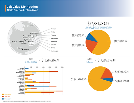
Develop visual analytics of the performance data in the health care innovation sector.
Our client is a Canadian leading health innovation center. This organization concentrates on creating a collaboration of health care, science, industry, not-for-profit and government partners whose aim is to help improve quality of life for the world’s ageing population, allowing older adults to age safely in the setting of their choice while maintaining their cognitive, emotional, and physical well-being.
With the purpose of efficiently conveying the client's stories and innovative projects to the public, the innovator and the investor, we developed and designed visual elements including data visualization, map and infographic to represent the message and idea of the client. Meanwhile, high-quality data visualization helps the client to promote itself, attract more attention from the public, and influence more people.


