The Decade of Mad Cow Disease
What The Guardian Wrote About the British Mad Cow Disease Crisis from 1986 - 1996
2018 - 2019, DATA VISUALIZATION,
GRADUATE THESIS PROJECT AT OCAD UNIVERSITY

ROLE
Researcher
Visual Designer
Data Viz Developer
DELIVERABLES
Research Strategy
Research Paper
Data Analytics
Story Flow
Interface Design
Interaction Developer
LINK
Tell the hidden stories about British Mad Cow Disease Crisis via an intuitive and interactive data visualization.
The Decade of Mad Cow Disease is the final prototype of my thesis project, Data Humanism: Examining how the British newspaper, The Guardian, depicted the British Mad Cow Disease Crisis from 1986–1996. This research examines the use of data visualization not only to inform audiences about a particular event but mainly to humanize data and uncover the missing content and hidden stories. My final prototype consists of online interactive storytelling and a data visualization design.
"We are ready to question the impersonality of a merely technical approach to data, and to begin designing ways to connect numbers to what they really stand for: knowledge, behaviours, people."
- Giorgia Lupi
Inspired by Giorgia Lupi's data humanism, and combined with the theories of thick data, local data, and feminist data visualization, I shaped my own understanding of Data Humanism: Data humanism is—an attitude of data visualization designers that not only focuses on numerics but also analyzes all related context, an approach to represent data with a human understanding story and intuitive visual design.
RESEARCH PROCESS
Multiple iterations help to discover the best method for data analysis.

DATA ANALYSIS
Visualization is not only a format to represent the data but also a methodology to explore hidden links across data.

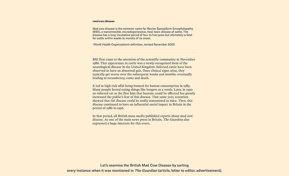
In this research, I reviewed The Guardian from 1986 to 1996 for every page that mentions Mad Cow Disease/Bovine Spongiform Encephalopathy (BSE) which is about 554 articles across hundreds of topics. To explore the connection between The Guardian articles and the British BSE outbreak, I applied Mapping as Research Methodology to build the links across the data.
STORY FLOW
Tell a story of Mad Cow Disease from General to Specific.

After reviewing the collected data, I decided to depict the British Mad Cow Disease Crisis through three stories:
A story is about how Mad Cow Disease became a popular topic in The Guardian, even the advertising mentioned it to promote goods and services!
A story to reveal the correlation between the news media's interest in Mad Cow Disease and the spread of Mad Cow Disease.
And, the last story reveals how the news media and public tend to be more and more comfortable to use BSE (bovine spongiform encephalopathy) rather than Mad Cow Disease.
INTERFACE DESIGN
I want the visual design to pass the audience a feeling related to newspaper, ink, old-style and The Industrial Revolution.


DATA VIZ POSTER DESIGN
Working with the same dataset, I used "THE GROWING PLANT" as the metaphor to illustrate how the influence and public interest of the British mad cow disease outbreak increases and expanded.
